I guess this isn't necessarily all that related to type, or particularly groundbreaking typographically, but I saw it the other day and still think it's cool:
Lyricmation: The White Stripes - We're Going to be Friends (HD)
Monday, March 23, 2009
Type week IX
Final week. Here we go:
 Orange Mobile the tagline says "Text messaging while driving prevents you from seeing what really matters." And the window filled up does a very good job of obscuring what's behind it. Also, the font sizes are altered a lot and do a good job of showing sort of an "internal hierarchy"; that some messages you write may be more important than others, even though they're all a distraction from what you're doing.
 Elle Style Awards 2008 The font on style awards 2008 is really interesting because it's so much more cutting edge than something that Elle would use generally, in my opinion. And granted, they're always trying to be on the cutting edge of fashion (and most often, are), but their masthead is so regal and proper. I guess that makes sense, because you'd like to know that their content is coming from where it should be, in that there's history and/or knowledge of some sort to back it up. The font for style awards 2008 is so edgy, though, that it sort of expresses that the magazine has the ability to throw the rules aside and latch onto what's new and hip right now.
 Live Now Tshirt I'm still not sure about this one. I find it interesting, but at the same time, the type is so abstract that it's almost not type anymore. I think it's on the cusp of being too abstract. I'm really not sure. I found it, and now I'm not sure about it... It's interesting, yes, but at the same time, the shapes that make up the letters are too separate. However, at the same time, that's part of what makes it so cool as type. I really don't know. (it came from Threadless, but I found it on Form Fiftyfive)
 Orange Mobile the tagline says "Text messaging while driving prevents you from seeing what really matters." And the window filled up does a very good job of obscuring what's behind it. Also, the font sizes are altered a lot and do a good job of showing sort of an "internal hierarchy"; that some messages you write may be more important than others, even though they're all a distraction from what you're doing.
 Elle Style Awards 2008 The font on style awards 2008 is really interesting because it's so much more cutting edge than something that Elle would use generally, in my opinion. And granted, they're always trying to be on the cutting edge of fashion (and most often, are), but their masthead is so regal and proper. I guess that makes sense, because you'd like to know that their content is coming from where it should be, in that there's history and/or knowledge of some sort to back it up. The font for style awards 2008 is so edgy, though, that it sort of expresses that the magazine has the ability to throw the rules aside and latch onto what's new and hip right now. Live Now Tshirt I'm still not sure about this one. I find it interesting, but at the same time, the type is so abstract that it's almost not type anymore. I think it's on the cusp of being too abstract. I'm really not sure. I found it, and now I'm not sure about it... It's interesting, yes, but at the same time, the shapes that make up the letters are too separate. However, at the same time, that's part of what makes it so cool as type. I really don't know. (it came from Threadless, but I found it on Form Fiftyfive)
Monday, March 16, 2009
Type week VIII
 O Not quite sure what's going on here, but it's cool. I would love to see more letters like this that formed a word/a forest.
 G.U. Done by an illustrator somewhere. Again, I don't really know what's going on, but it looks cool.
Eight Associates I guess this might be the same thing as one that I brought in earlier. If so, the other one is definitely cooler; it's made completely of eights. I guess the numeral 8 is just that easy to incorporate in with type.
Monday, March 9, 2009
Type week VII, part 2
 Thomas Broomé illustration This are works by a Swedish artist where, in place of textures and/or colors present, objects are made up of words describing what they are. I like it because it does a good job at showing scale, since the size of the type changes depending on what the object is being represented.
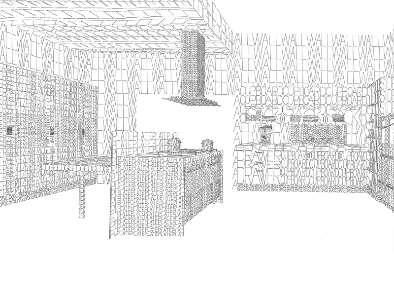
 And yes! Mosaics! Totally cool! It's nice because it's an unexpected representation of this font in tiles, which I don't think are generally associated with a font this curvy. I think this is at a fish and chip shop in Britain.
Thursday, March 5, 2009
Type week VII, part 1
 United Airlines (done by Mcann-Erickson in London) I got to these ads from the photographer, but the honest truth is that the photos are blah and really nothing special. The magic is in the body copy. Each of the ads in the campaign (and there are about seven or eight of them) is in the shape of a building from one city or another (or just sort of a non-descript building, which is okay as well, I guess). But I still think they're totally cool (minus the photography, which honestly, is stupid).
Monday, March 2, 2009
Type week VI

 Wired Magazine This was done by a designer in LA for Wired, and I like it because I feel it communicates the essence of the magazine; just that everything is interconnected, whether we think it or not.
 Obama in Our House This is a project concerning people living where ever and a cardboard cutout of President Obama. I honestly don't know too much about it, I don't think there was too much more to find out about it. But it looks cool, and the contrast between the font and the letters made from household objects is nice.
 Eight This was done by a design shop in Britain called Stylo design, and oh, snap! This is totally amazing! I love it!
Monday, February 23, 2009
Type week V
 More interesting characters I like this because of its commentary on the English language. While I realize there are no diacritics in the language, even set as it has been here, you can still understand exactly what's being said. It's almost as though the accents and whatnot are completely ignored (except for the eszett, which kind of throws you off, since we have nothing like it in English...)
 Ford logo This was created by Paul Rand in 1966, and the gives a completely different feel to the brand than what they decided upon and use now. It's similar, yes, but there's something about it that communicates a different feeling. In a way, less grungy, and also in a way, less tough.
louder This is the identity done by Kokoro & Moi, a design agency in Helsinki. I like how it was designed in a simple font, and instead, the idea is communicated through the increasing weight of the font. The weight alone is enough to express the idea behind the logo.
Monday, February 16, 2009
Type week IV
 Ork Posters Whoa! This is totally cool! The city (cities; the artist also does prints of Brooklyn, Manhattan, NYC as a whole, SF, LA, etc.) is broken up into neighborhoods, and the name of each is typeset into its boundaries however it will fit.
 Alphabet I like this because the letters contained are broken down into their simplest elements, and those are used to create the letters. Nothing else. The artist doesn't use anything beyond rectangles, triangles and circles (and circle parts), and with those is able to create every letter.
Cathedral This is another one created from type solely. Everything put together is made up from a letterform. It's amazing what you can do with them.
Monday, February 9, 2009


Monday, January 26, 2009
Type week I

AOL I find this type interesting, because while it doesn't explicitly mimic the font that a matrix/HAL-style computer would feature, it gives that impression. It almost seems as though the computers are in control, and that the message is coming from the computers rather than from the people who are operating them. Also, in a completely different vein, it gives the feel of those old clocks and bank calendars that had the type cut into two parts, in a way. Half of each letter/number was printed on each part to facilitate flipping pages from day to day. I feel like this font gives that feel, though the "page flipping" would be from left to right (as a book reads), rather than top to bottom.
 Justice The nice thing about this type is that it gives a three-dimensional feel. I find it intriguing, because instead of having the front face colored, it's got the side and bottom faces colored, and makes my eye work to see the solid shape that's created by the negative space. Alternatively, it's also possible to look at it just straight, and ignore the fact that the negative space is/can be activated to form its own shape in addition to what's printed there.
 Transformations of a public space
This type is interesting becasue the treatment expresses exactly what the text itself is saying. Instead of being a solid color, it takes a "traditional" font and makes the body of each letter run so that it's a piece of art on its own. The design is in the type because it needs to be; there's nothing else (image or otherwise) that's there.
"Do what you can, with what you have, where you are." --T. Roosevelt
Type week II
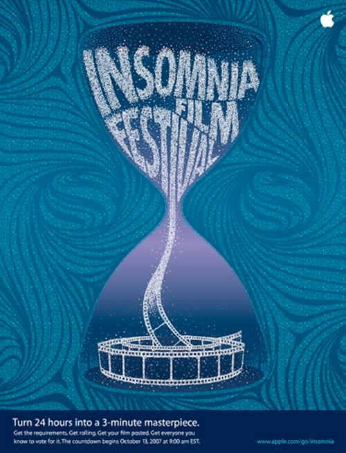
 Grammys For the Grammys this year, advertising was created by Chiat/Day, and the images were of selected artists (this one, though, is the grammy trophy). The text used to create the images are at least 15 songs that inspired the artist (in this case, I would figure it's grammy winning songs instead). I find these pieces interesting because of the use of different typefaces to depict different song types/feelings. Just as songs have different tones and feelings, so do different fonts.
 Sky Type This project was done by a student in Germany. She walked around a city and photographed letterforms as they appeared. I like it becasue it proves that it's possible to find type everywhere, it's all around us, even when it's not printed on a piece of paper.
 the sea and cake I like the font used in the design of this album cover (looks like helvetica neue) because it matches the photography used (actually taken by the lead singer around the streets of Chicago). The simplicity of the photography is mimicked by the fact that that font is used.
Subscribe to:
Posts (Atom)